
Amazon Listing Image Best Practices: Why Your Product Photos Matter More Than You Think
On Amazon, your images are not just decoration. They are one of the most important selling tools on the entire listing.
A strong Amazon listing needs optimized titles, bullet points, descriptions, backend search terms, and keyword alignment. Those elements help Amazon understand what your product is and when to show it in search. But once the shopper lands on the listing, the images often do the real selling.
Most Amazon shoppers are browsing on a mobile phone. That means they are making decisions on a small screen, often quickly, and often by swiping through images before they ever read the full bullet points. If your images do not communicate clearly on mobile, you are likely losing sales.
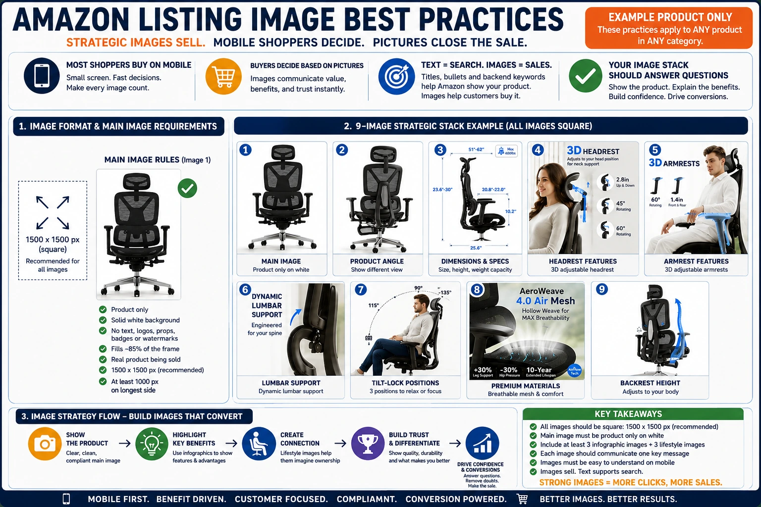
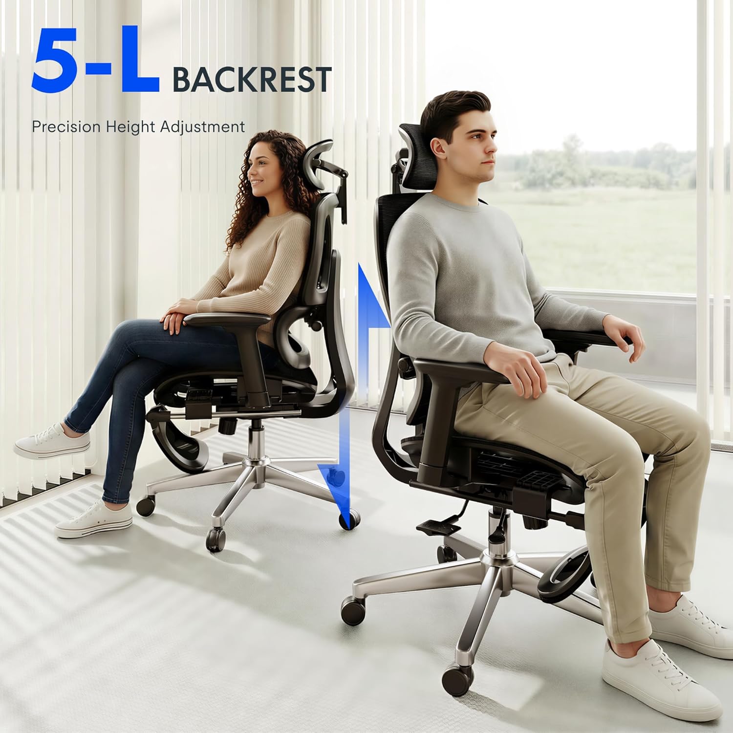
The chair images shown here are a good example of how product images can do more than simply show the item. They show the product, explain the features, communicate dimensions, highlight comfort points, and help the customer understand why this chair is different from other office chairs.
Start With Amazon’s Basic Image Requirements
Before thinking about design, lifestyle images, or infographics, sellers need to understand the basic compliance expectations.
Amazon’s main image requirements are strict. The main image should show the actual product being sold, on a pure white background, with no added text, logos, watermarks, badges, graphics, props, or accessories that are not included with the product. Amazon also expects the product to fill most of the frame, commonly around 85% of the image area. (Amazon Seller Central)
Amazon recommends images that are at least 1,000 pixels on the longest side so customers can use zoom. For most sellers, a better working standard is to create square images at 1500 x 1500 pixels or larger. This gives you a clean, consistent image set that works well across desktop, mobile, and Amazon’s zoom experience. Amazon image files generally need to fall within Amazon’s accepted size and format rules, including formats such as JPEG, PNG, TIFF, or GIF depending on the image type. (Amazon Seller Central)
For most product listings, I recommend building every listing image as a clean square, ideally 1500 x 1500 pixels. This size is large enough for clarity, easy to manage, and consistent with how Amazon presents product images across the marketplace.


The Main Image Has One Job: Show the Product Clearly
The main image is the image that appears in Amazon search results. It is also the first image shoppers usually see on the product detail page.
This image is not the place to get creative with text, badges, arrows, callouts, lifestyle backgrounds, or marketing claims. The main image should be clean, compliant, and easy to understand instantly.
A strong main image should:
Show only the product being sold.
Use a solid pure white background.
Fill the frame as much as possible without cutting off the product.
Avoid unnecessary shadows, props, or distractions.
Make the product recognizable even as a small thumbnail.
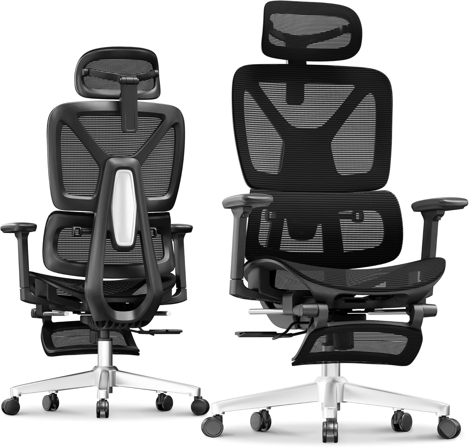
In the chair example, the clean product-only images are the kind of images that would be appropriate for the main image position. They show the chair clearly, with no lifestyle setting and no extra visual messaging. That is exactly what the main image is supposed to do.
The Rest of the Image Stack Should Sell the Product
After the main image, sellers have more room to educate and persuade.
This is where infographic images and lifestyle images become extremely important. A good image stack should not just repeat the same product photo from different angles. It should answer the customer’s questions before they need to ask them.
For most Amazon listings, a strong image stack should include at least:
Three infographic-style images.
Three lifestyle images.
One or more close-up detail images.
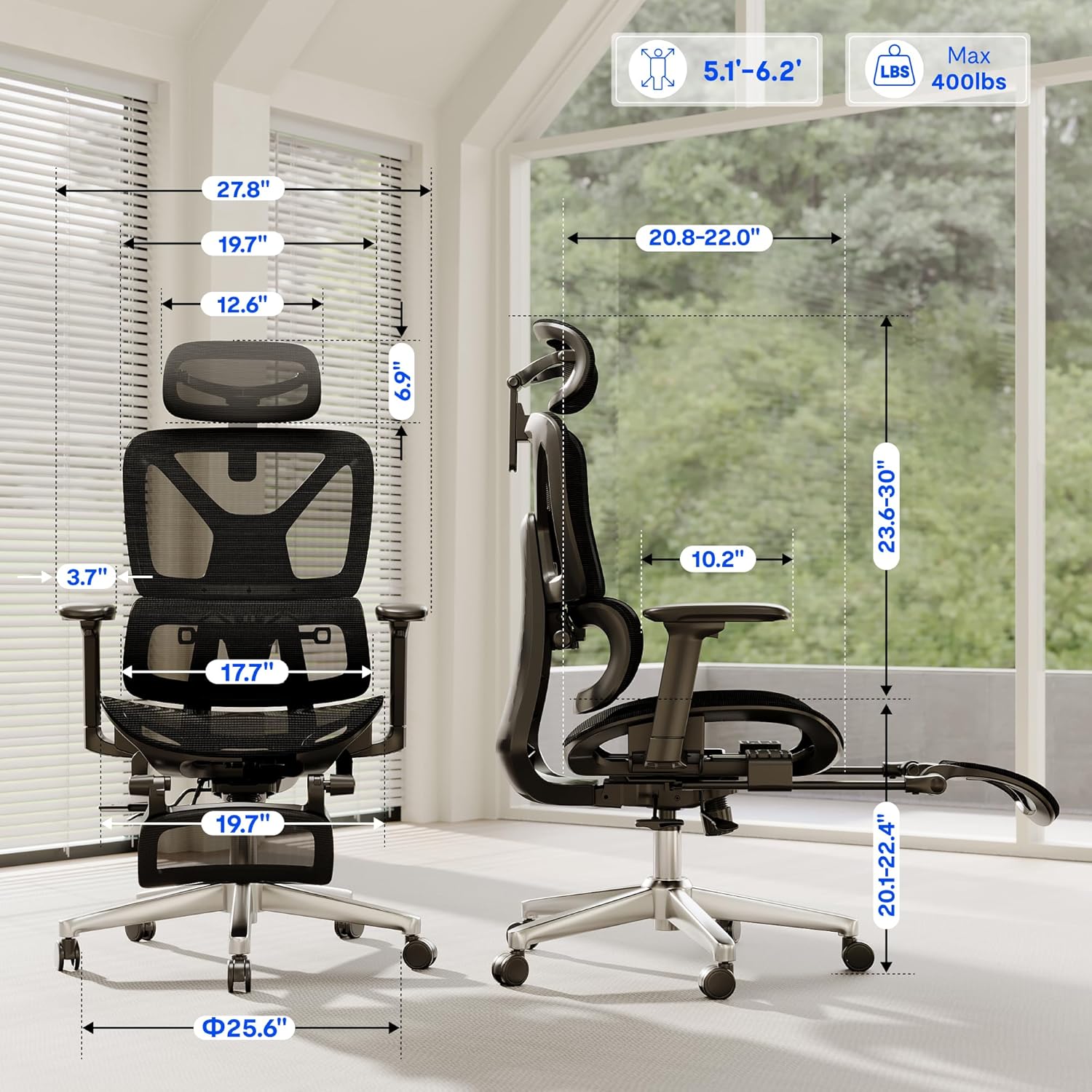
One image that communicates size, scale, or dimensions.
One image that explains the product’s biggest differentiators.
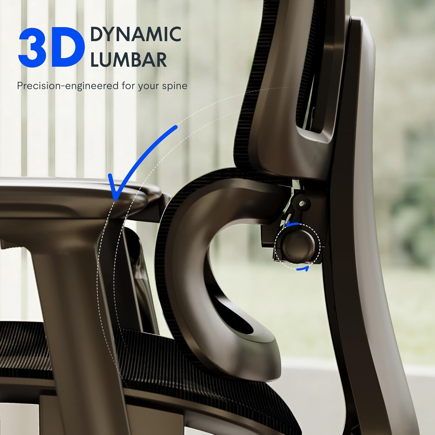
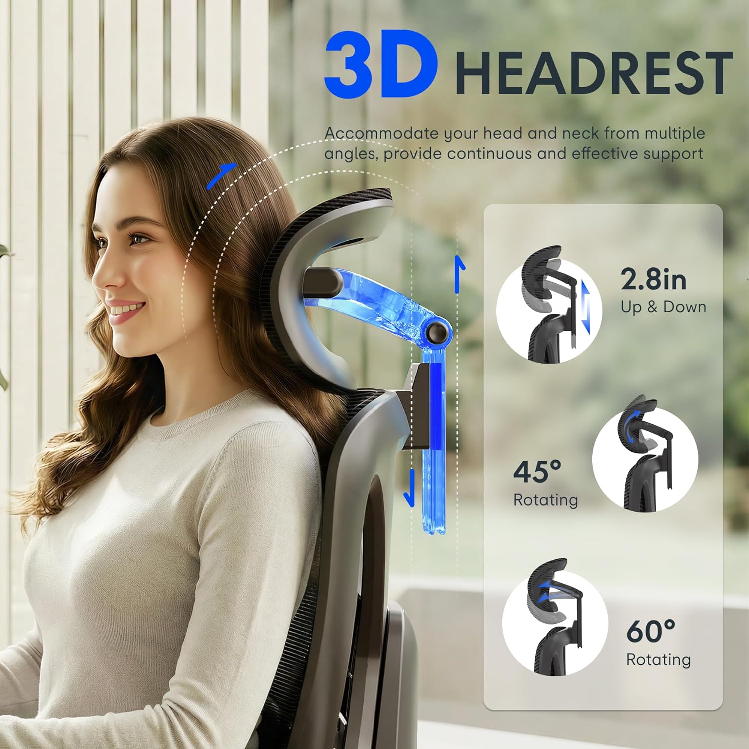
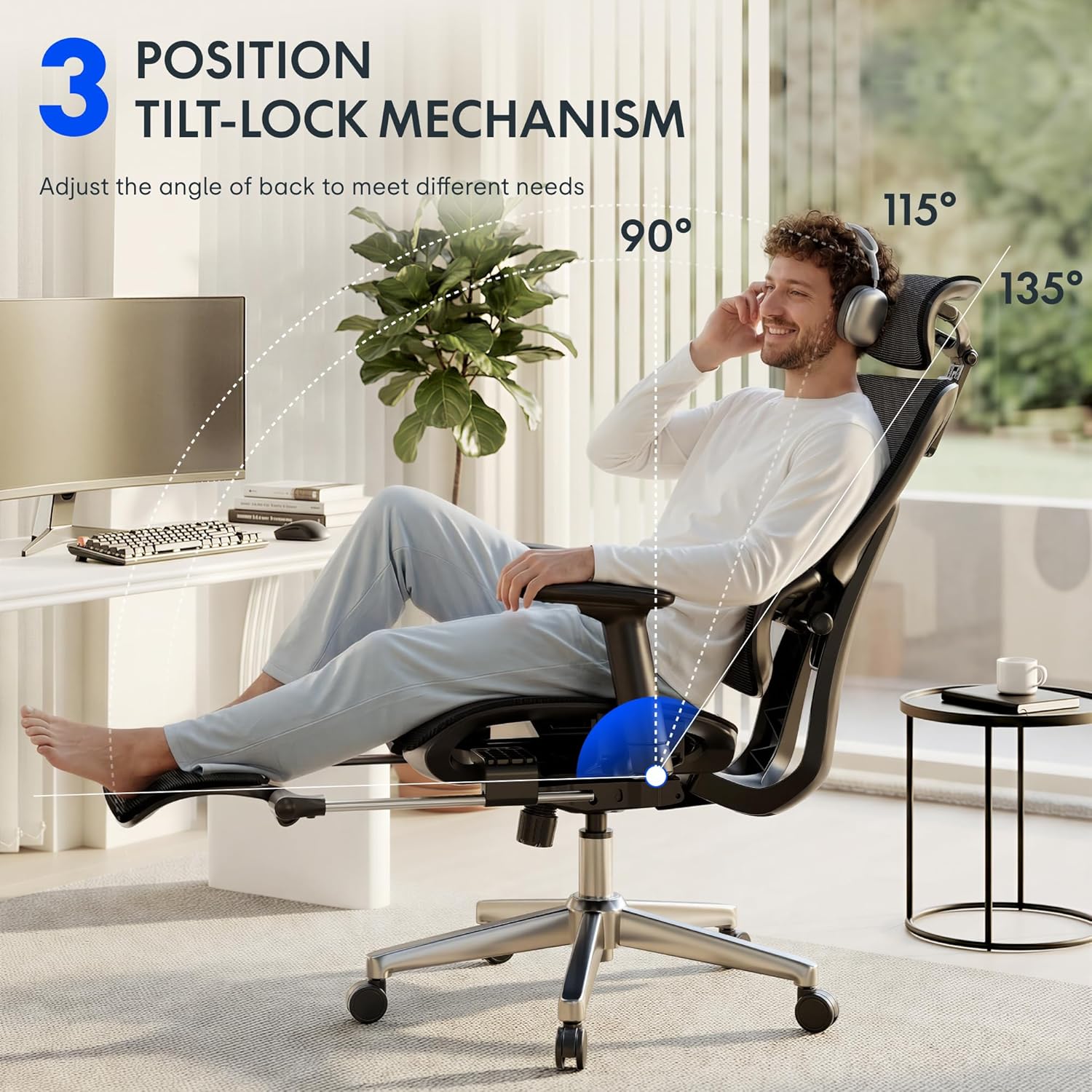
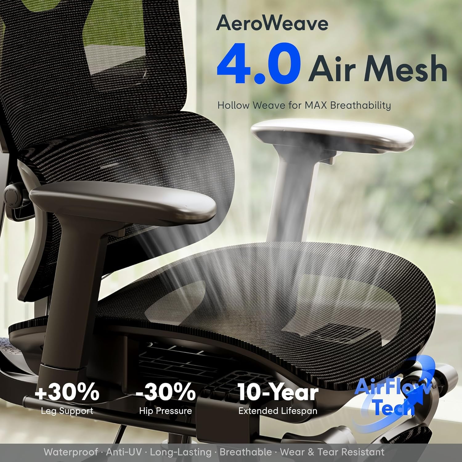
The chair example does this well. The images explain the 3D headrest, adjustable armrests, lumbar support, tilt-lock positions, mesh material, weight capacity, height range, and dimensions. These are not just pretty pictures. They are selling points converted into visual form.
That is the goal.
Infographic Images Should Make the Product Easier to Understand
Infographic images are useful because they combine product photography with simple callouts, icons, arrows, measurements, or short text.
For example, the chair images call out:
3D headrest adjustment.
3D armrest movement.
Dynamic lumbar support.
Tilt-lock positions.
400 lb load capacity.
Air mesh breathability.
Backrest height adjustment.
Seat and chair dimensions.
These are the exact kinds of details customers care about when comparing products. A shopper may not read every bullet point, but they will usually swipe through the images. If the benefits are shown clearly in the images, the customer absorbs the information faster.
The key is to keep infographic images simple. Do not overload the image with too much text. Do not make the shopper pinch and zoom just to understand the point. Every image should communicate one primary message.
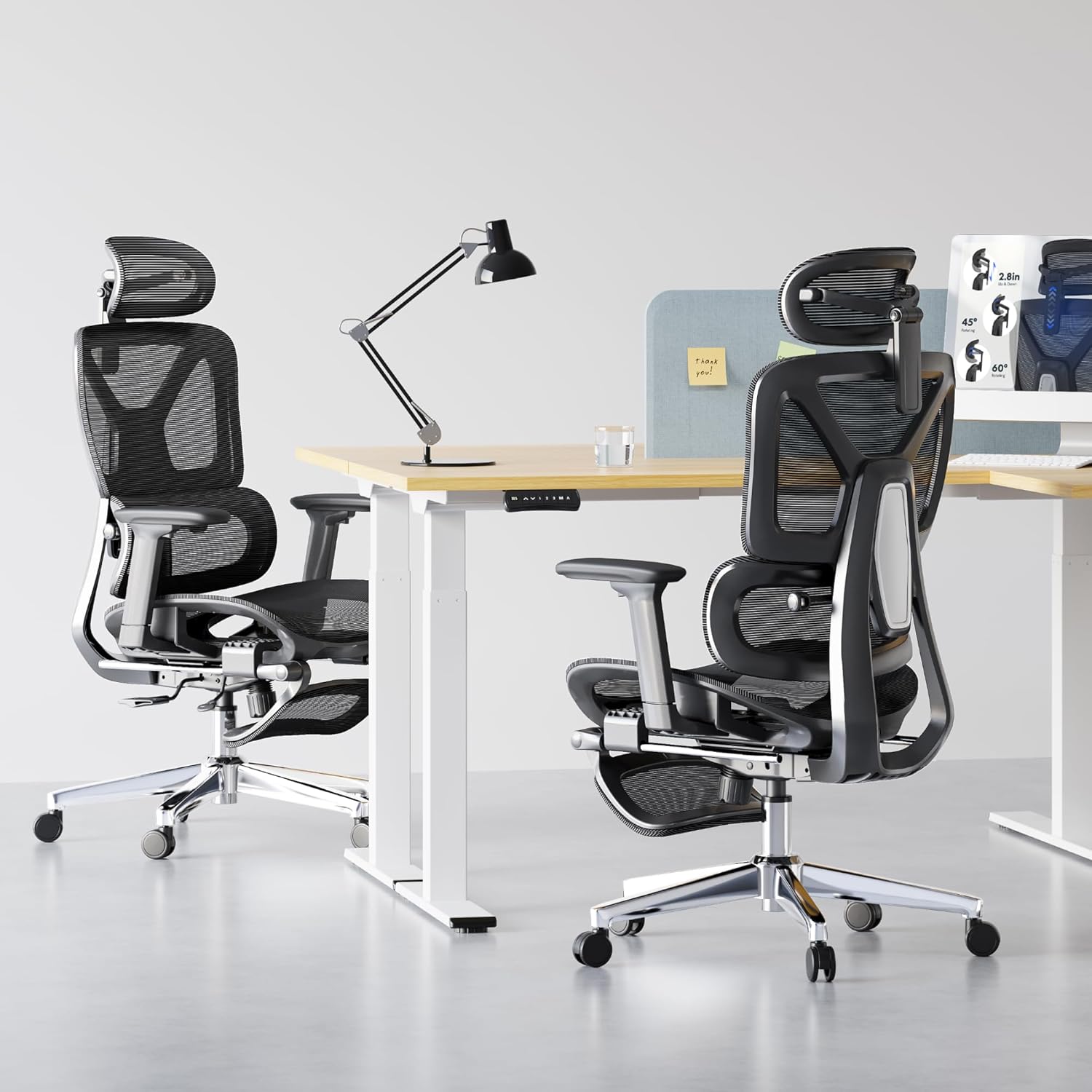
Lifestyle Images Help the Customer Picture Ownership
Lifestyle images show the product in use. They help the customer imagine the product in their own life.
For the chair, lifestyle images show people sitting in the chair in a home office or work environment. This helps communicate comfort, posture, use case, and scale. It makes the product feel real instead of just technical.
A lifestyle image can also function as an infographic. For example, an image can show someone sitting in the chair while highlighting the tilt angle, armrest adjustment, or lumbar support. This is often more effective than showing those features in isolation because the customer sees the benefit in context.
The best lifestyle images answer the question: “How will this product fit into my life?”
Mobile First: The Most Important Image Strategy
The biggest mistake sellers make is designing images for a desktop monitor instead of a phone.
Most Amazon shoppers are not sitting at a large computer screen carefully reading every word. They are scrolling on a mobile phone. The screen is small. Their attention span is short. Your image has to work instantly.
That means:
Text must be large enough to read on mobile.
Each image should focus on one clear message.
The product should be large in the frame.
Callouts should be short and direct.
Avoid cluttered layouts.
Avoid tiny feature icons that disappear on a phone.
Do not make the customer work to understand the benefit.
This is why Amazon listing images are so important. The title and bullet points help with search, indexing, and keyword relevance. But images are often what the buyer uses to decide whether the product looks right, feels trustworthy, and solves the problem.
In plain English: Amazon SEO may get the shopper to the listing, but images often close the sale.
Product Images Should Communicate Differentiation
Every product listing should answer one basic question:
Why should someone buy this product instead of another similar product?
The images need to help answer that.
For the chair, the differentiators appear to be adjustability, ergonomic support, breathable mesh, high weight capacity, and multiple comfort settings. Those are exactly the things the images should emphasize.
For any product, sellers should identify the top five to seven reasons a customer would choose it. Then each image should be built around one of those reasons.
Examples include:
Better materials.
Larger size.
Improved comfort.
Stronger construction.
More adjustability.
Easier installation.
Safer design.
Better compatibility.
More complete kit.
Longer lifespan.
The goal is not to make generic images. The goal is to visually explain why the product is better, easier, stronger, more useful, or more trustworthy.
Do Not Use Images That Create Compliance Problems
Amazon gives sellers flexibility with secondary images, but that does not mean anything goes.
Avoid misleading claims, exaggerated results, fake badges, competitor references, unauthorized logos, medical claims without support, or text that promises something the product cannot clearly deliver.
Also be careful with images that show accessories, props, or situations that could confuse the customer about what is included. If something appears in the image but is not included with the product, make sure the image does not imply otherwise.
For example, if an office chair image shows a desk, monitor, lamp, or footrest, the image should make it obvious that those items are lifestyle props and not part of the purchase.
A Strong Amazon Image Stack Should Follow a Plan
A good image sequence for many products could look like this:
Image 1: Main product image on pure white background.
Image 2: Product angle or hero image showing the product clearly.
Image 3: Primary benefit infographic.
Image 4: Secondary feature infographic.
Image 5: Lifestyle image showing the product in use.
Image 6: Dimensions or size chart.
Image 7: Materials, construction, or durability image.
Image 8: Comparison, compatibility, or use-case image.
Image 9: Final lifestyle or brand-support image.
Not every product needs the exact same sequence, but every product needs a strategy. Do not just upload random images because they look nice. Every image should have a job.
Final Thought: Images Are the Listing’s Sales Presentation
Amazon sellers often spend a lot of time worrying about keywords, titles, bullet points, and backend search terms. Those are important, but they are only part of the equation.
Images are where the customer understands the product.
Images are where the customer compares features.
Images are where the customer builds trust.
Images are where the customer decides whether the product feels worth the price.
The best Amazon listings use images as a sales presentation. They show the product clearly, follow Amazon’s compliance rules, explain the most important features, and make the product easy to understand on a mobile screen.
If your listing images do not communicate quickly, clearly, and visually, the shopper may never get far enough to read the rest of the listing. That is why image strategy should never be treated as an afterthought. On Amazon, strong images are not optional. They are one of the biggest drivers of conversion.